Pro PO Manager
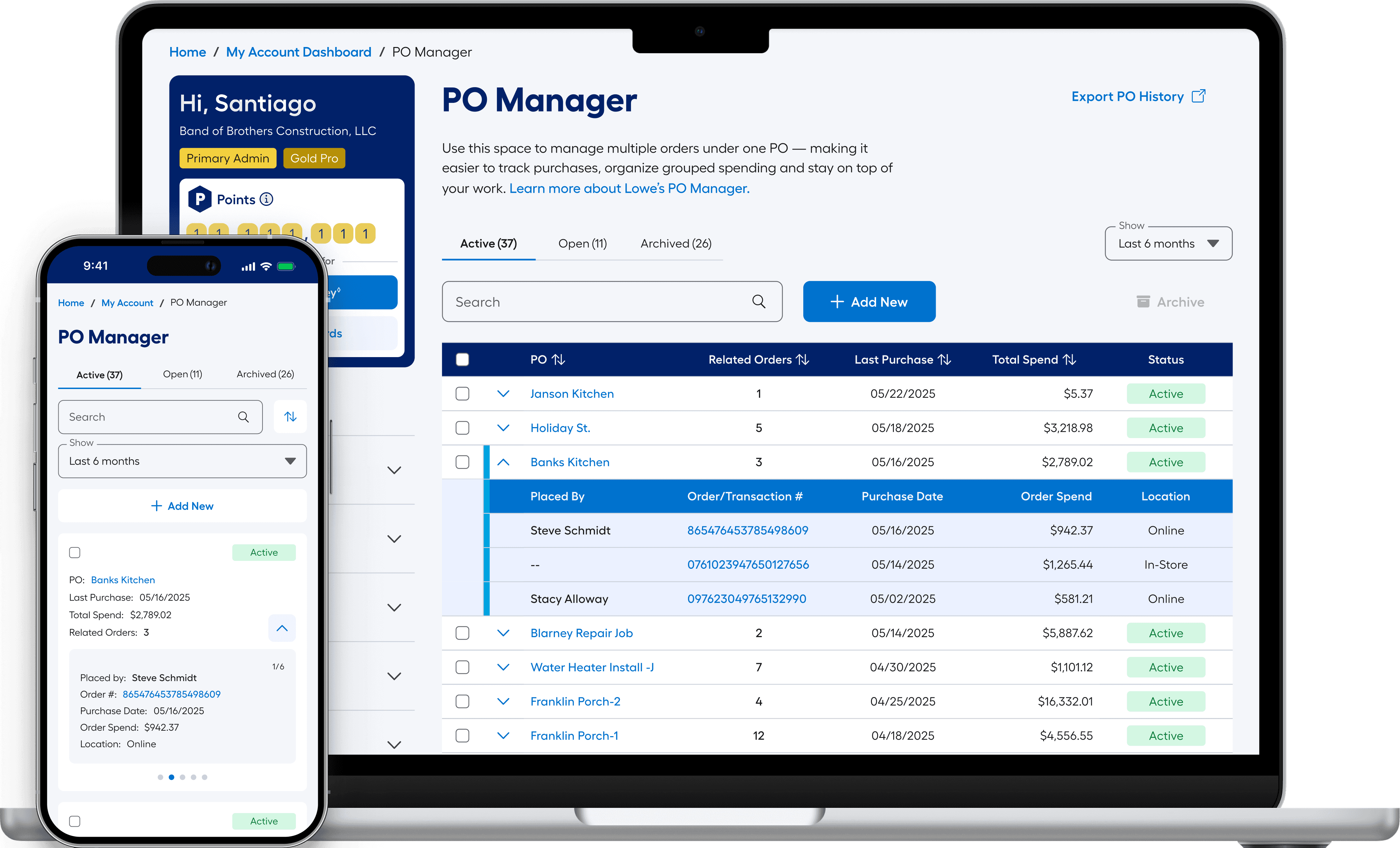
The Pros asked and we delivered: a PO management system built from the ground up — to help our users input, recall, and manage project details at scale.
The Pros asked and we delivered: a PO management system built from the ground up — to help our users input, recall, and manage project details at scale.
Disclaimer: Due to proprietary information, some of the details have been modified or obscured.
Disclaimer: Due to proprietary information, some of the details have been modified or obscured.
Client:
Client:
Lowe's Home Improvement Inc.
My Role:
My Role:
Senior Design Lead with 2 reports
THE BIG PICTURE
Pros are a big deal at Lowe’s and the data is there to prove it. Between 2019 and 2024, Pro sales grew from 19% to nearly 30% of Lowe's total revenue — roughly $13.7B to $25.1B. Even in years when DIY softened, Pro held positive. The trajectory was clear: the Pro customer wasn't just important, they were becoming the business.
$25B
$25B
$25B
Pro Revenue in 2024
+83%
+83%
+83%
Pro sales growth past 5 years
+312%
+312%
+312%
Increase in export usage across tools
Competitors were already offering Pros real organizational tools — spend dashboards, structured PO tracking, job-level reporting. Our Pros noticed. What they had at Lowe's was a single open text field and a recollection test every time they made a purchase. PO values were typed freehand, forgotten by checkout, duplicated across teammates, and impossible to govern. The data existed but the system to make it usable didn't.


The System Was Lacking
The Problem
POs in the existing system were one-offs. There was no reliable way to know if a value already existed, how it had been entered before, or whether what you were typing matched anything in the system. Every entry started from scratch — and usually ended there too.
Even for Pros who were diligent about entering accurate values, the system offered no way to manage them over time. No way to recall, organize, or govern what had been entered. No way to know if a subordinate used the same value differently. The data accumulated — but it was hard to extract the usefulness.
"Sometimes I'm like, 'I could've sworn I put it in the system' — and then later I realize I had some extra letter or something."

Jack F.
-Medium Pro | Project Manager
Accept Anything, Give Back Nothing
Jacks experience above wasn't just a one-off. The field accepted anything — and Pros gave it everything. PO numbers, job names, project nicknames, abbreviations, addresses. Some typed it in full, some shortened it, some skipped it entirely. No two teammates were guaranteed to use the same value for the same job.
Admins had one convention. Subordinates had another. And without any structured recall, even a single user could enter the same project three different ways across three different orders. The field wasn't broken — it just had no rules. And without rules, the data it collected was essentially unreferenceable.
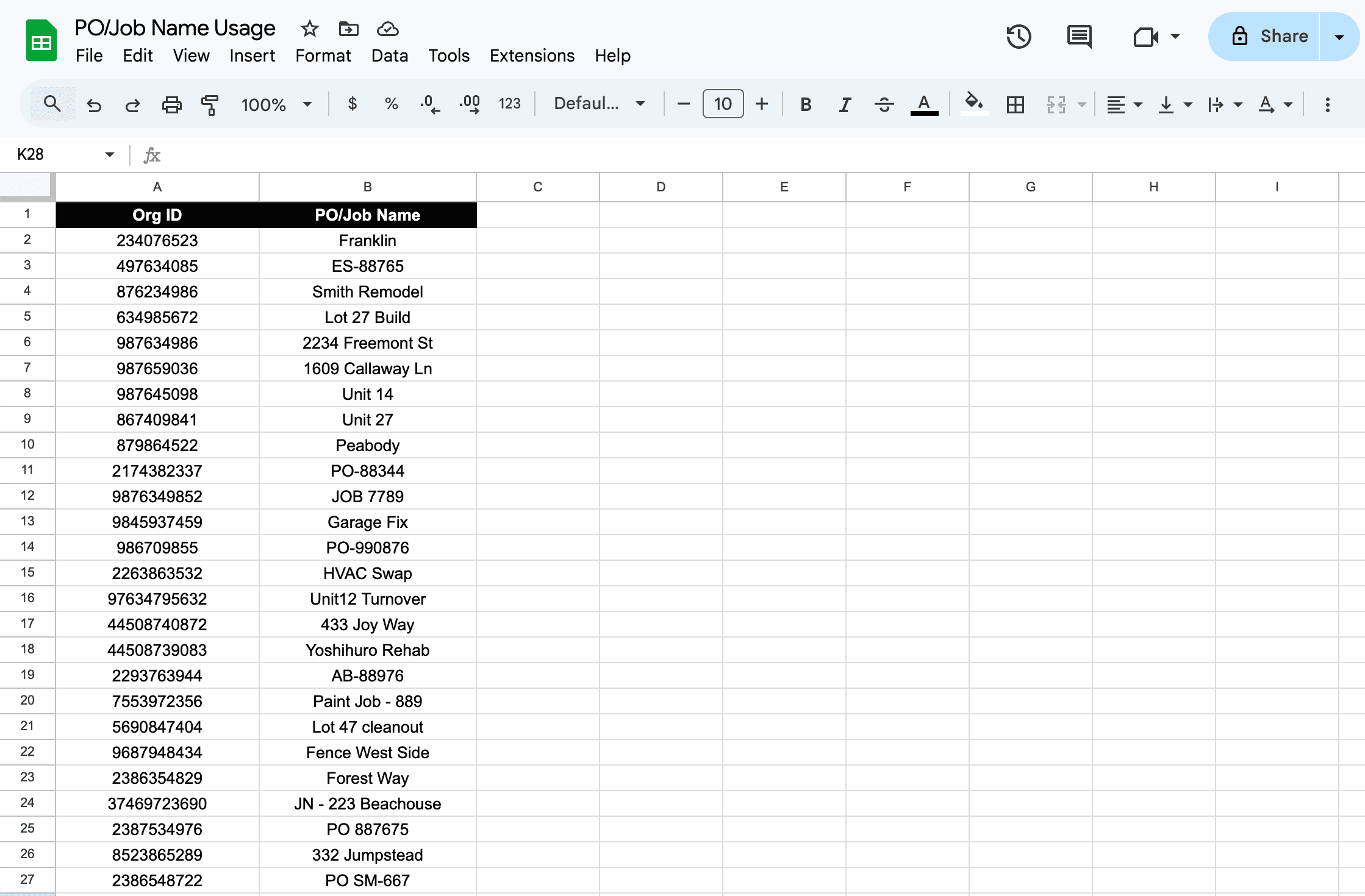
A dataset showing the variety of values users were entering into the split PO/JN field. Data modified for confidentiality.
It wasn't just an internal pattern. Across forums and community threads, Pros were already asking each other the same questions — questions that, frankly, the system should have been answering.
It wasn't just an internal pattern. Across forums and community threads, Pros were already asking each other the same questions — questions that, frankly, the system should have been answering.
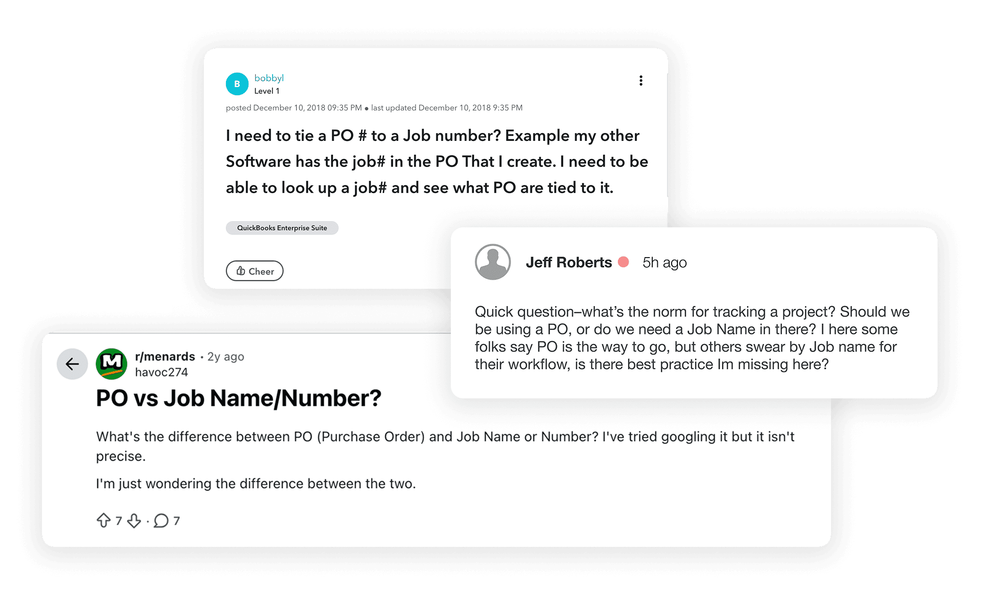
Some of the confusion felt by users, Pros, and associates.
The confusion wasn't anecdotal — it was systemic. And the numbers inside our own platform confirmed what Pros were already venting about publicly. The field had become a reflection of the problem itself: full of data, short on meaning.
The confusion wasn't anecdotal — it was systemic. And the numbers inside our own platform confirmed what Pros were already venting about publicly. The field had become a reflection of the problem itself: full of data, short on meaning.

Did you Know?
Required POs: 17% of Pro accounts require a PO entry at checkout. This can be helpful in forcing organization but…
Hacking the System: Somewhere between 3-12% of all inputs by subordinates on PO-required accounts resulted in bogus values to get past the *required screen entry.
Customer vs Vendor POs: In our internal system, a PO field sometimes occurs in similar locations on the screen, but can refer to 2 separate values, either a Customer PO or a Vendor supplied PO, adding to confusion.
Associates Felt the Pain Too
To understand how associates were actually experiencing the system, I went to the source — shadowing interactions at the Lowe's Pro Desk firsthand. What I found extended the problem well beyond the customer side.
Associates weren't just navigating customer confusion — they were dealing with their own. Our internal systems surfaced two distinct types of POs: ones entered by customers and vendor-supplied POs that existed independently. Both could appear in similar locations on screen. Neither was clearly labeled. Associates were left to sort out which was which in real time, mid-transaction.
It got worse. Whether the PO field appeared at checkout at all depended on the customer's card type. Business card — field shows up. Personal card — it doesn't. A significant portion of our Pros shop on personal cards. The result: the same Pro could have a completely different checkout experience depending on how they were paying that day. Not a user problem. A systemic one
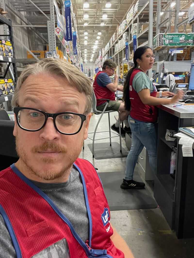


Left: At my local Lowe's Pro Desk as I shadowed associate and user interactions. Middle & Right: Examples of the many disparate locations where POs might occur.
The pain wasn't isolated to one user type or one surface. It ran through the whole system — from the customer filling out a field, to the associate trying to make sense of it, to the data that came out the other side. Something had to change at the root.
The pain wasn't isolated to one user type or one surface. It ran through the whole system — from the customer filling out a field, to the associate trying to make sense of it, to the data that came out the other side. Something had to change at the root.
One Pivot, Two Frameworks
The research made one thing clear — patching the existing field wasn't enough. We needed to rethink how PO data entered the system, how it was recalled, and how it was managed over time. That meant one deliberate pivot and two new frameworks to support it.

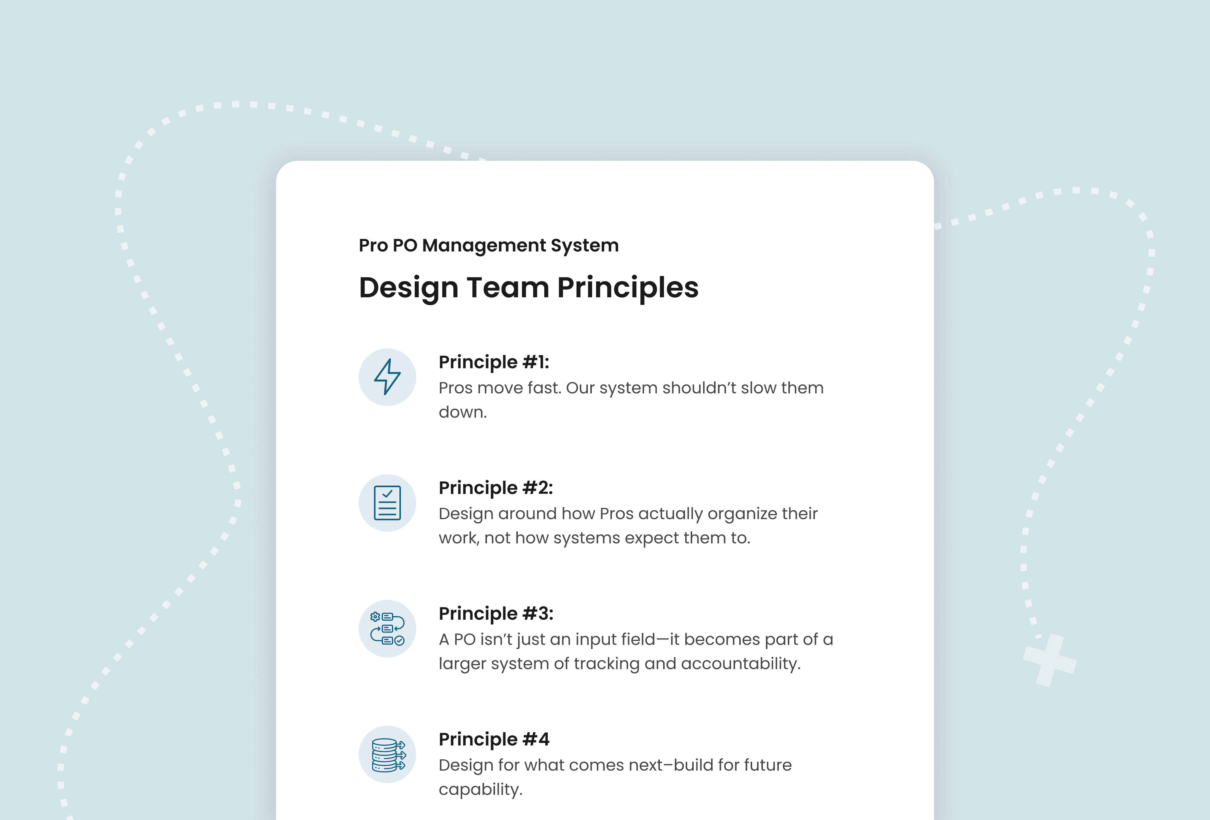
Before a single screen was designed, I synthesized everything the team had surfaced and established a set of design principles. A shared framework to keep everyone aligned on what we were building and why — so that every decision downstream pointed in the same direction.
Before a single screen was designed, I synthesized everything the team had surfaced and established a set of design principles. A shared framework to keep everyone aligned on what we were building and why — so that every decision downstream pointed in the same direction.
With the pivot made and the inconsistencies mapped, we had enough structure to start building. Through an iterative process — testing with real Pros along the way — we secured the backing we needed for the first major piece of the puzzle: the Smart PO Entry Field.
With the pivot made and the inconsistencies mapped, we had enough structure to start building. Through an iterative process — testing with real Pros along the way — we secured the backing we needed for the first major piece of the puzzle: the Smart PO Entry Field.
Solving For Our Pros
The Smart Input Field
Building a system to manage POs only works if the data feeding it is sound. That meant solving for entry first — before anything else.
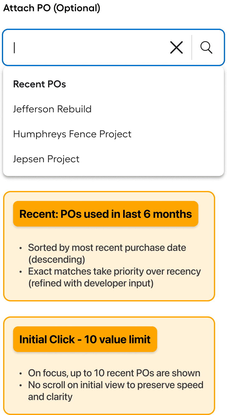
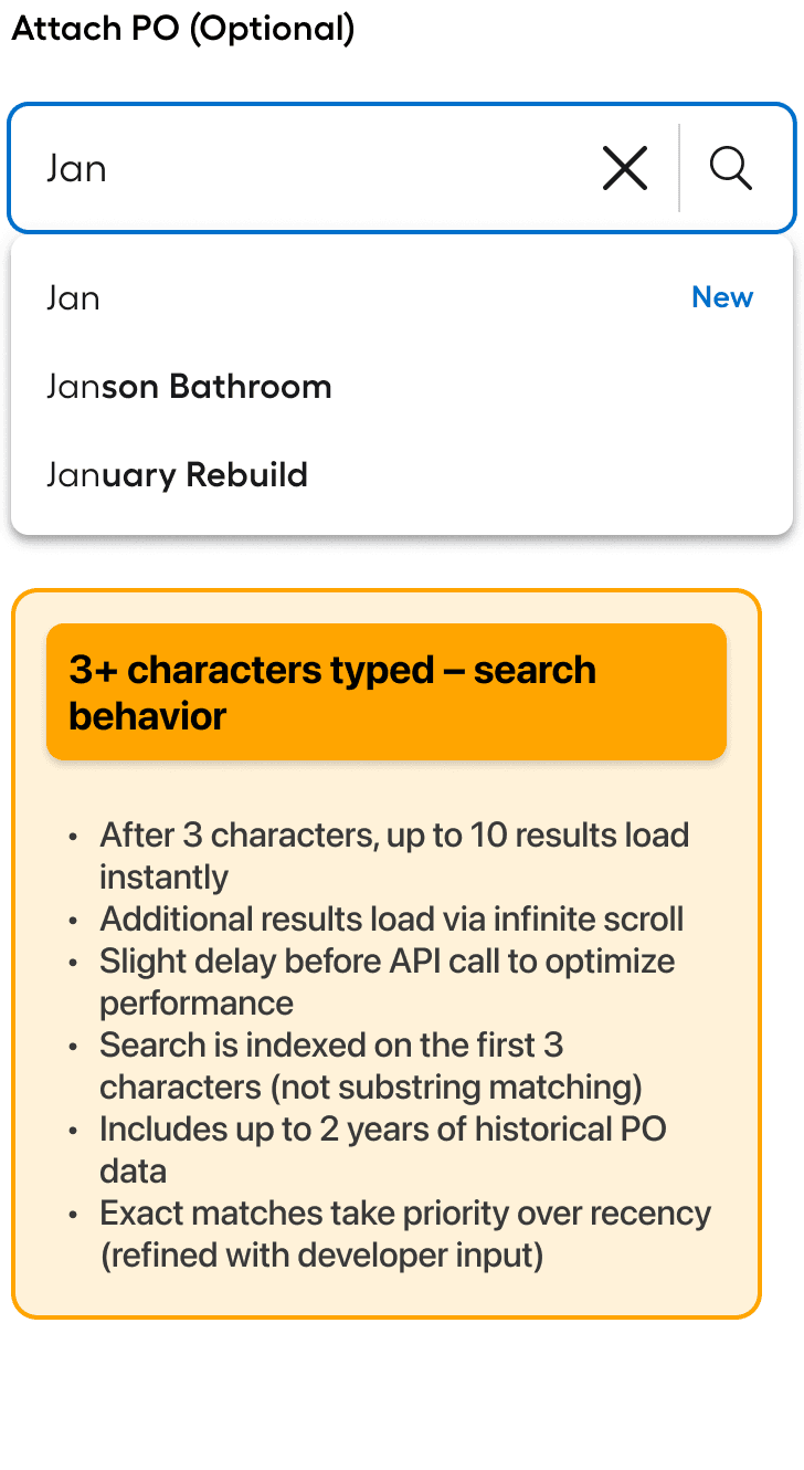
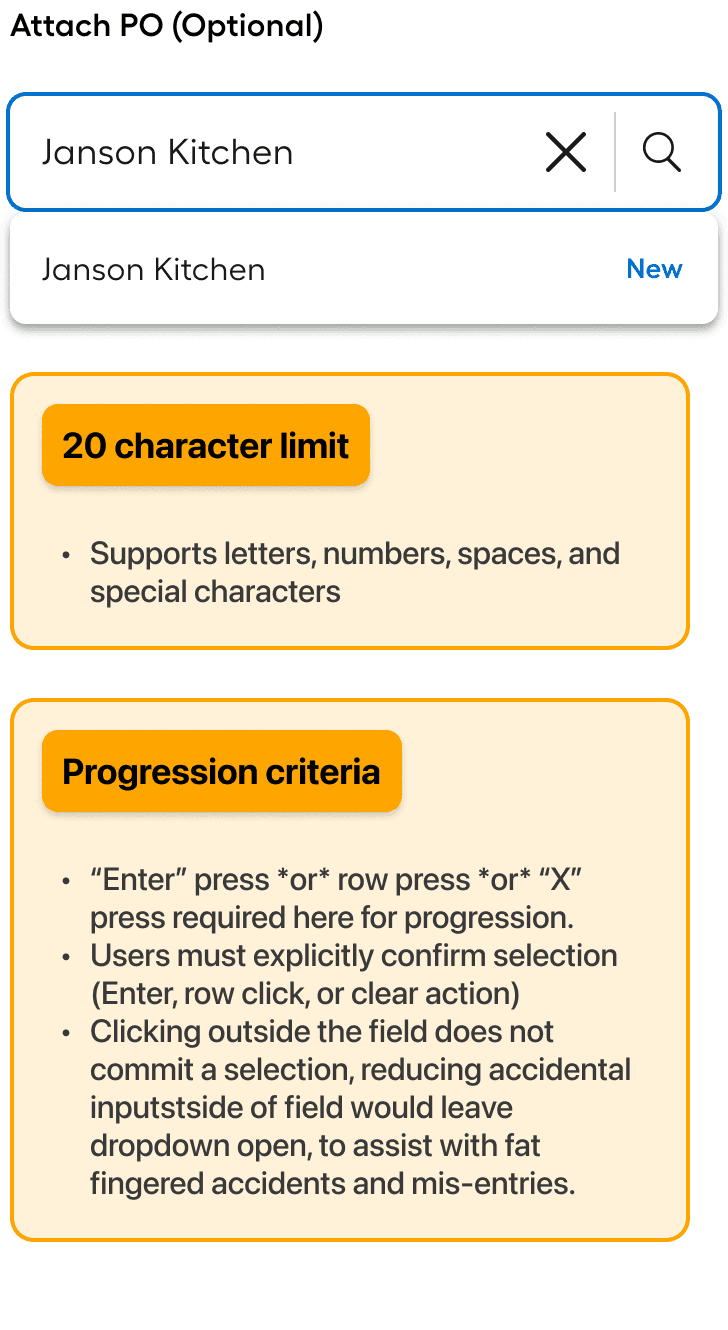
We already had predictive search in our global experience, so the question kept nagging at me: why couldn't the PO field work the same way? A user can only know if they need a new entry by checking what already exists — and that visibility simply wasn't there. When I proposed the idea, I got a lot of blank stares, not because the idea wasnt sound but becaue it simply hadnt been done before.
After low-fidelity prototypes and some back-and-forth with engineering, we had enough buy-in from stakeholders and devs to move forward. Part search, part entry — nobody quite knew what to call it, but the value was undeniable.
The Smart PO Entry Field was born.
✨
Key Insights
“Recents” made the first release: "Recents" was almost deprioritized for first release, but strong user testing results (84% of users rated it 5 or higher on a Likert scale) led to a shift in priority, allowing it to make the final release.
Show exact matches: There were some issues with some POs getting pushed further down the list of results than desired, so we reconfigured some of the backend rules so that a 100% match would show earlier.
Seamless for subordinates: The input was designed to work naturally for users restricted to existing POs. Those users tested 92% as high in satisfaction scores as Admins, proving their experience didn't feel limited or incomplete.
The field was working. Pros could now attach POs with confidence — recalling existing values, searching on demand, and only creating new ones when truly needed. But structured entry was only half the equation. Once POs were in the system, what happened to them?
The field was working. Pros could now attach POs with confidence — recalling existing values, searching on demand, and only creating new ones when truly needed. But structured entry was only half the equation. Once POs were in the system, what happened to them?
The PO Manager - Match the Mental Model
The Smart Entry Field solved how POs got into the system. The PO Manager solved everything that came after. We could have stopped at the field — it was already a meaningful improvement. But the real opportunity was bigger: a dedicated space where Pros could see, organize, and govern every PO in their organization. Not a patch on an existing screen. Something built specifically for the job.
We tested early and often — low-fidelity concepts with real Pros before a single polished screen was built. The goal was to make sure the system matched how they actually thought about their work, not how we assumed they did.
“Ahh, ok — I see what you’re doing here. Now I can actually see who made this purchase and when. This should give me less paperwork.”

Julio G.
-Medium Pro | Owner
Information: Nested as it Should
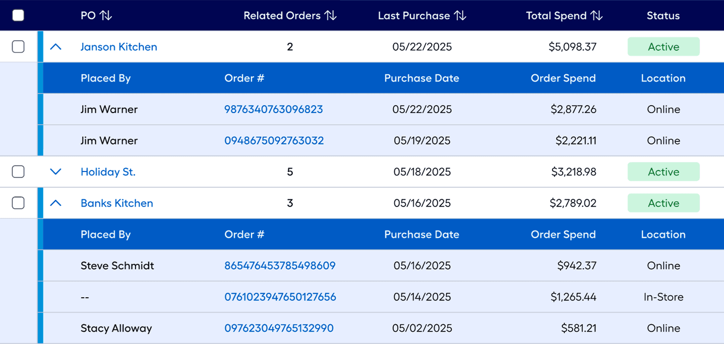
As the system took shape, it became clear that not all information deserved equal weight. A Pro scanning their POs needs the headline facts — what the PO is called, how many orders are under it, last purchase date, total spend. That's first order information. Clean, fast, scannable.
But sometimes you need to go deeper. Who placed that order? How much was it? Was it in-store or online? That's second order information — available on demand, tucked behind an expand. The default view stays uncluttered. The detail is always there when you need it.
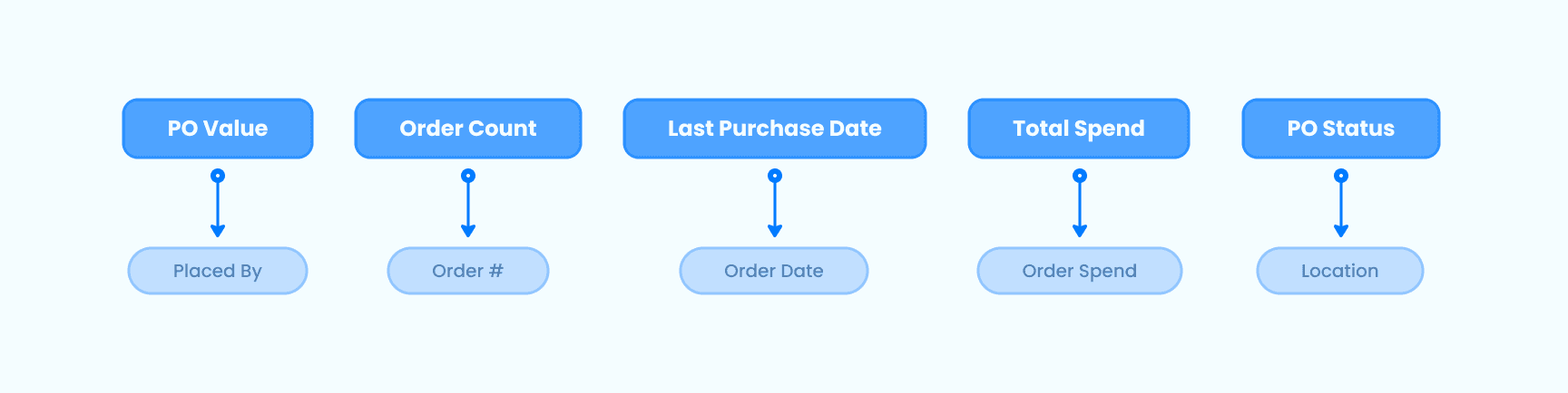
A graphic showing the relationships determined to be "valued pairs" as determined by in-person interviews, working sessions, and card sorting.
The expand works great for drilling into a single PO — but it also unlocks something more powerful. How did this bathroom remodel compare to the one down the block? Open both, and the answer is right there. No spreadsheet, no hunting. Just the data, side by side.
The expand works great for drilling into a single PO — but it also unlocks something more powerful. How did this bathroom remodel compare to the one down the block? Open both, and the answer is right there. No spreadsheet, no hunting. Just the data, side by side.
Intuitive Status CHanges
POs don't live forever — they follow a lifecycle, often in lockstep with the projects they represent. The challenge was keeping active ones front and center without permanently losing anything that might still be needed down the road.
The answer was a simple status system, shaped with direct input from engineering on what the data model could actually support. Each status type dictates exactly what actions are available — no guesswork, no room for accidental data loss.
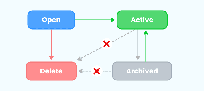
A simple diagram showing the various status directions a PO can move between.
The logic is deliberate. An Open PO — one with no orders attached — can be deleted cleanly. An Active PO — one with at least one order associated — can only be archived, never deleted. Removing it outright would corrupt the order history tied to it. And an Archived PO isn't gone — if a client calls back and needs that project reopened, one tap brings it back. No new PO needed. The data was never lost, just set aside.
The logic is deliberate. An Open PO — one with no orders attached — can be deleted cleanly. An Active PO — one with at least one order associated — can only be archived, never deleted. Removing it outright would corrupt the order history tied to it. And an Archived PO isn't gone — if a client calls back and needs that project reopened, one tap brings it back. No new PO needed. The data was never lost, just set aside.
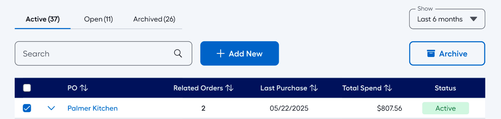
A view of the various states that a PO can be in. Notice the right CTA that becomes activated if a PO is selected.
The desktop experience was built to handle the full weight of the system. But our Pros aren't always at a desk—what about the runner bringing concrete to the jobsite?
The desktop experience was built to handle the full weight of the system. But our Pros aren't always at a desk—what about the runner bringing concrete to the jobsite?
Tables Are For Offices, Not Jobsites
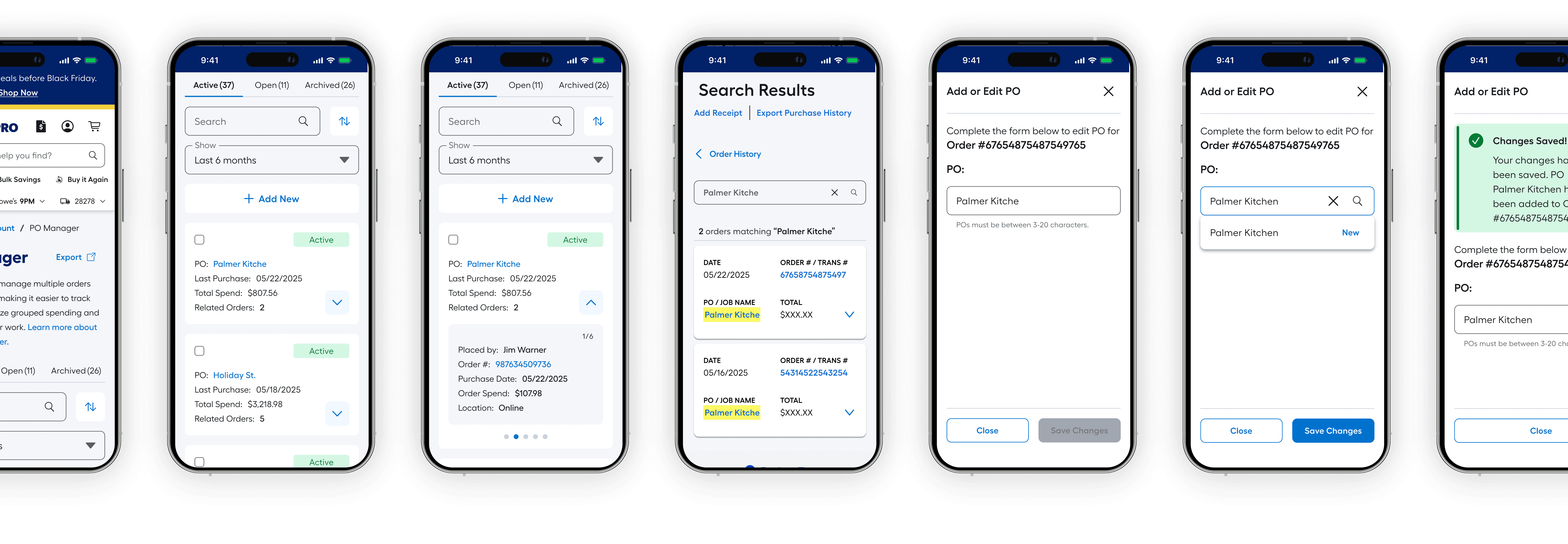
A table that works beautifully on desktop can be a nightmare on a 6-inch screen. We didn't want to water down the table just to fit — we wanted to craft a different take with as much care as the desktop experience.
User research made the direction clear: Pros preferred cards on small devices. Not a shrunken table, not a horizontal scroll — a card-based layout that surfaces the right information at a glance, with the ability to drill down when needed. Same data, smarter presentation. It took some convincing — our lead dev had reservations — but the research spoke for itself.
Learning In The Moment
Not everyone is going to get the system right away — no matter how streamlined it is. We considered overlays, walkthroughs, guided tutorials and we scrapped it all. What we landed on was a simple flyout that hits the basics and gets out of the way. Get them back to work with no scrolling required.
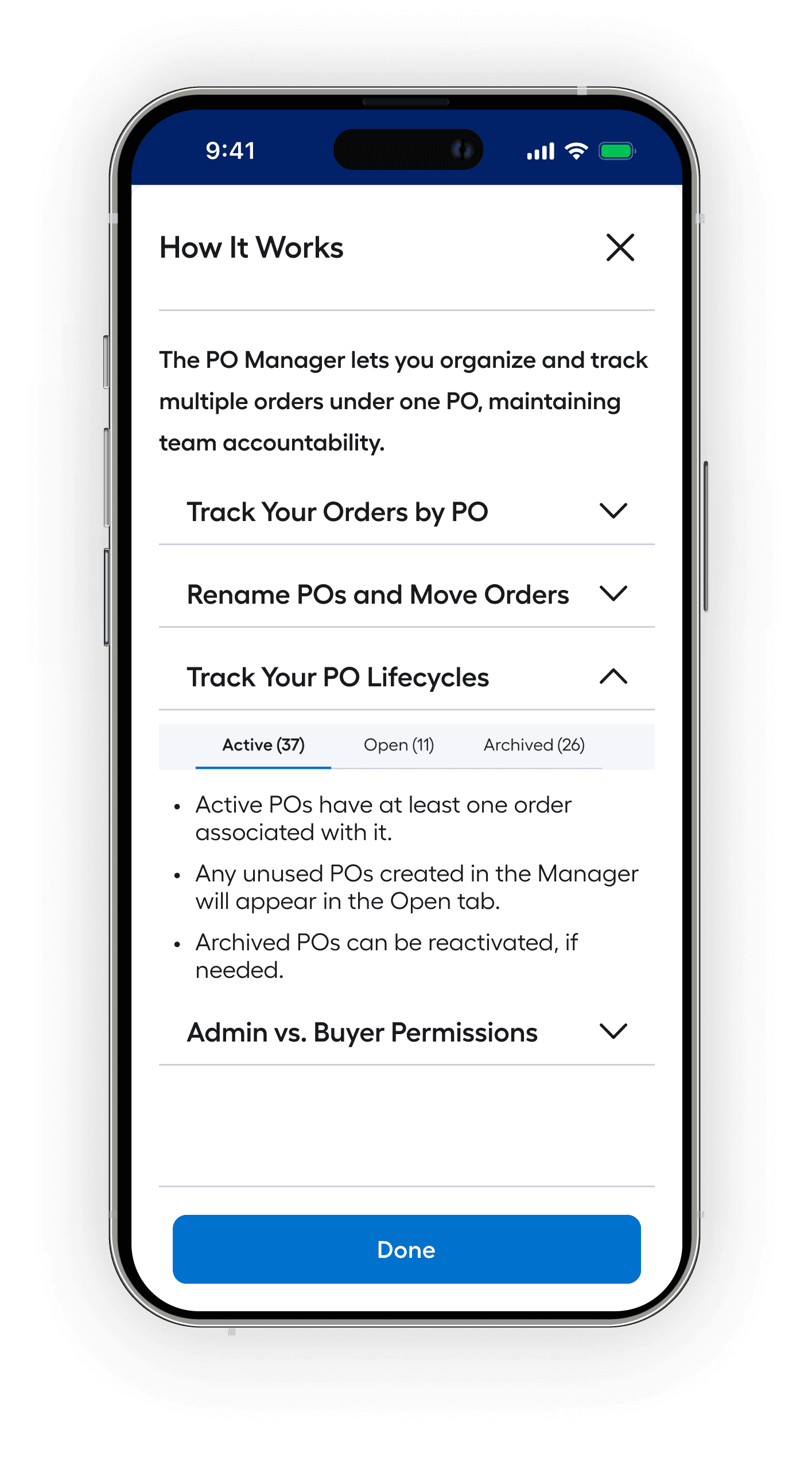
The four topics in the flyout weren't chosen arbitrarily — they were the top four reasons users told us they'd open it in the first place. We didn't guess, we listened.
The four topics in the flyout weren't chosen arbitrarily — they were the top four reasons users told us they'd open it in the first place. We didn't guess, we listened.
Exporting Made The Cut
Export was slated to miss the first release entirely, but the feedback from our largest Pros was undeniable: they use external systems and they needed export functionality on day one.
Devs were overcommitted — but when our biggest clients speak, we listen. Priorities were shifted, mountains were moved. With backing from our stakeholders and Senior PM Hetal, it made it above the line for first release.
"It's mission critical for us to include Export in the initial launch. Based on our reps feedback from our larger accounts, this is core for our Q3 release timeframe."

Hetal C.
-Sr. PM | Pro Services
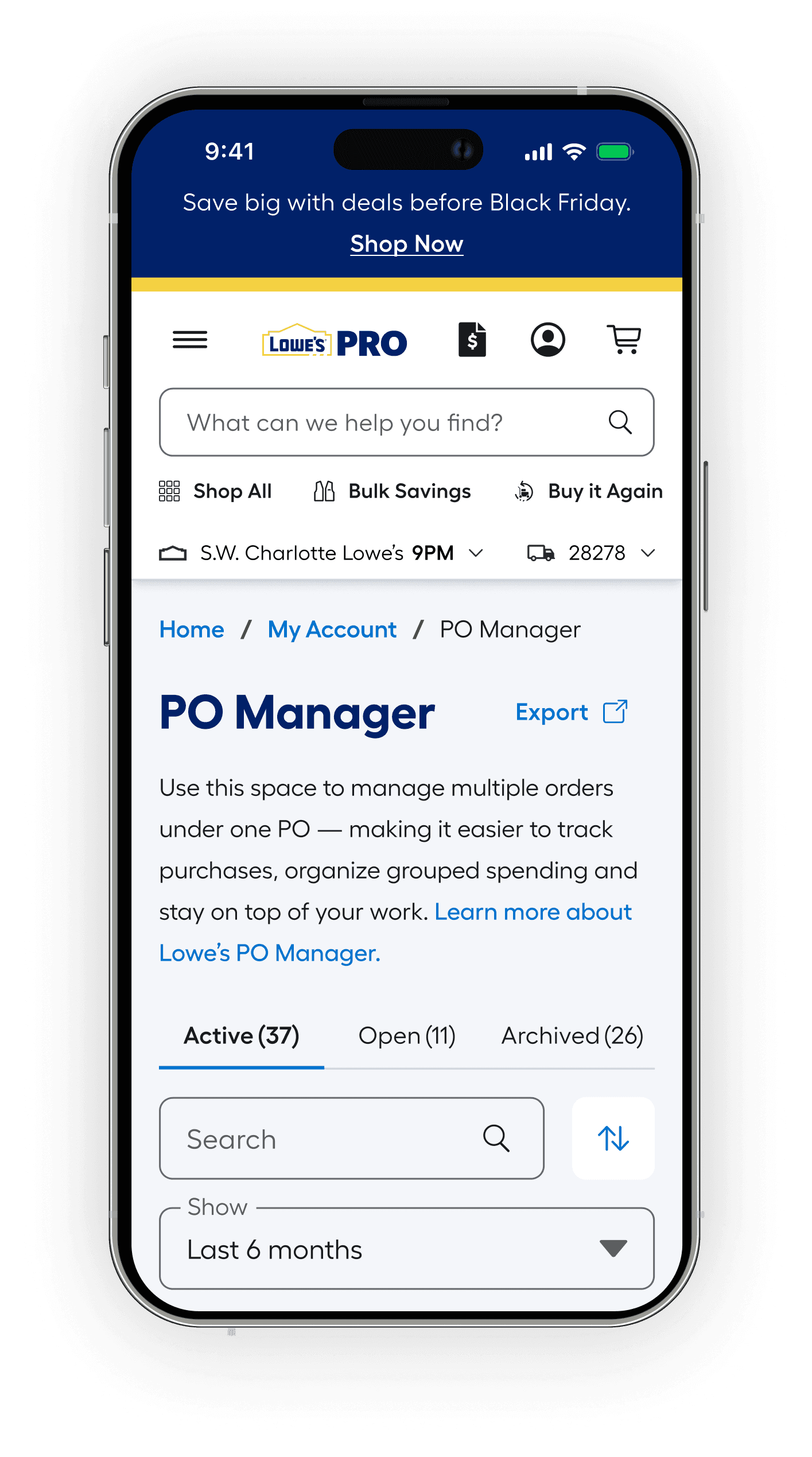
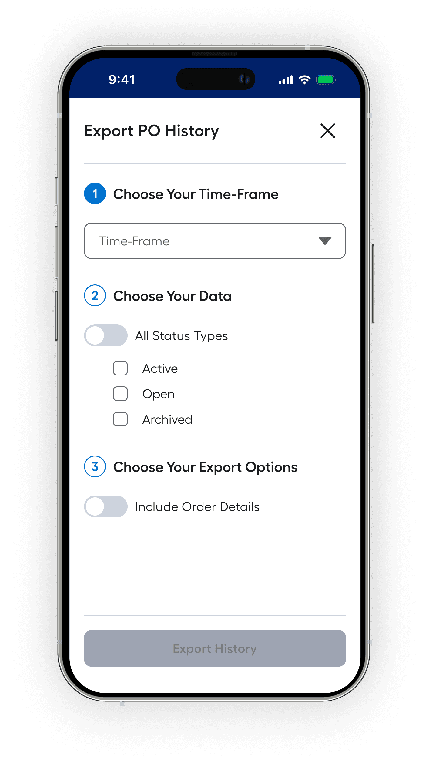
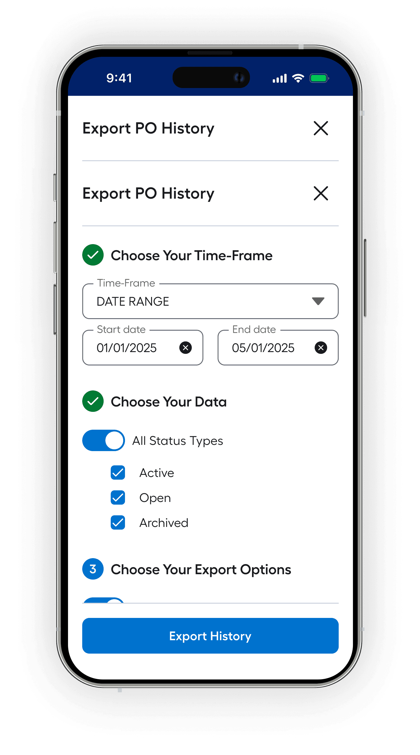
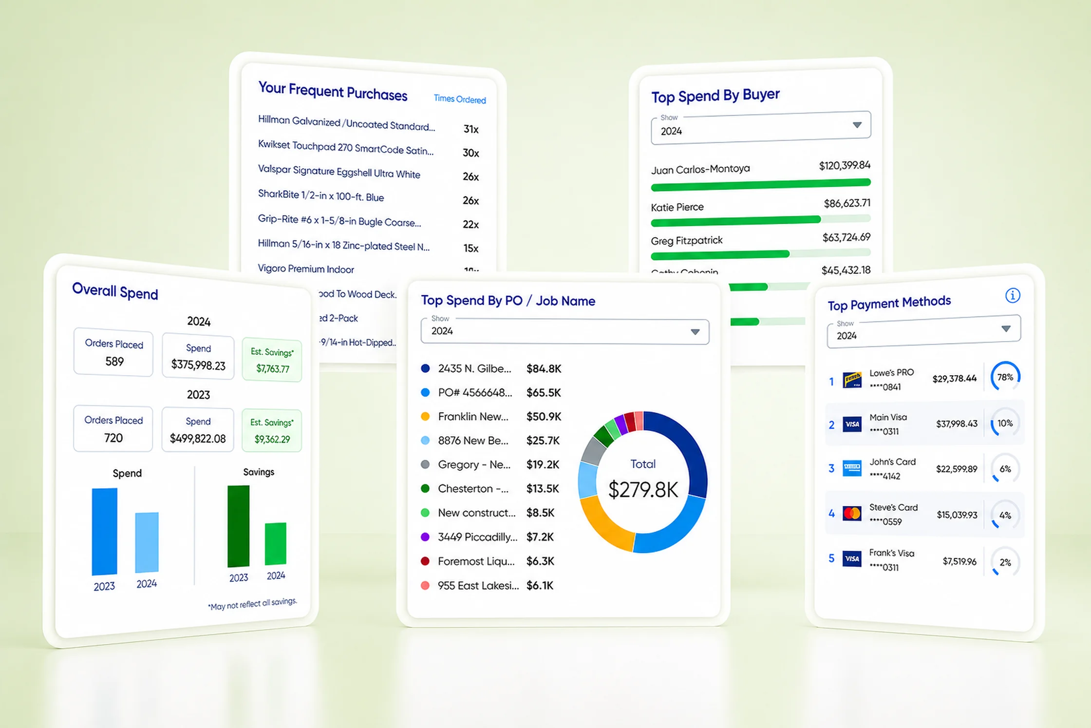
Getting the Export flow right meant more than just building something functional. I collaborated closely with the designer who inherited the Spend Reports & Analytics project — a system I had worked on before being brought onto PO Manager — to make sure our export experiences were consistent.
Same patterns, same logic, same feel. Two products, one ecosystem.
Release Feedback and the future
The numbers told one story. The behavior told another. Pros weren't just using the system — they were investing in it. Cleaning up old entries, standardizing values, building habits around a tool that finally gave their data somewhere worth putting it. That's not adoption. That's ownership. And for a product built from scratch, on a problem nobody had solved before, that's the best possible outcome.
+62%
+62%
+62%
Increase in PO reuse rate
-57%
-57%
-57%
Duplicate PO Entries
+30K
+30K
+30K
New PO creations in first 2 weeks
The launch was celebrated by Lowe's leadership as a cornerstone of our broader Pro strategy — a commitment to meeting Pros where they actually work, not just where we want them to shop. PO Manager isn't a standalone feature. It's a foundation.
The deeper we can partner with our Pros in managing their projects, tracking their spend, and running their businesses — the stronger that relationship becomes.
We're just getting started.
More Projects
Pro PO Manager
The Pros asked and we delivered: a PO management system built from the ground up — to help our users input, recall, and manage project details at scale.
The Pros asked and we delivered: a PO management system built from the ground up — to help our users input, recall, and manage project details at scale.
Disclaimer: Due to proprietary information, some of the details have been modified or obscured.
Disclaimer: Due to proprietary information, some of the details have been modified or obscured.
Client:
Client:
Lowe's Home Improvement Inc.
My Role:
My Role:
Senior Design Lead with 2 reports
THE BIG PICTURE
Pros are a big deal at Lowe’s and the data is there to prove it. Between 2019 and 2024, Pro sales grew from 19% to nearly 30% of Lowe's total revenue — roughly $13.7B to $25.1B. Even in years when DIY softened, Pro held positive. The trajectory was clear: the Pro customer wasn't just important, they were becoming the business.
$25B
$25B
$25B
Pro Revenue in 2024
+83%
+83%
+83%
Pro sales growth past 5 years
+312%
+312%
+312%
Increase in export usage across tools
Competitors were already offering Pros real organizational tools — spend dashboards, structured PO tracking, job-level reporting. Our Pros noticed. What they had at Lowe's was a single open text field and a recollection test every time they made a purchase. PO values were typed freehand, forgotten by checkout, duplicated across teammates, and impossible to govern. The data existed but the system to make it usable didn't.
The System Was Lacking
The Problem
POs in the existing system were one-offs. There was no reliable way to know if a value already existed, how it had been entered before, or whether what you were typing matched anything in the system. Every entry started from scratch — and usually ended there too.
Even for Pros who were diligent about entering accurate values, the system offered no way to manage them over time. No way to recall, organize, or govern what had been entered. No way to know if a subordinate used the same value differently. The data accumulated — but it was hard to extract the usefulness.
"Sometimes I'm like, 'I could've sworn I put it in the system' — and then later I realize I had some extra letter or something."
Jack F.
-Medium Pro | Project Manager
Accept Anything, Give Back Nothing
Jacks experience above wasn't just a one-off. The field accepted anything — and Pros gave it everything. PO numbers, job names, project nicknames, abbreviations, addresses. Some typed it in full, some shortened it, some skipped it entirely. No two teammates were guaranteed to use the same value for the same job.
Admins had one convention. Subordinates had another. And without any structured recall, even a single user could enter the same project three different ways across three different orders. The field wasn't broken — it just had no rules. And without rules, the data it collected was essentially unreferenceable.
A dataset showing the variety of values users were entering into the split PO/JN field. Data modified for confidentiality.
It wasn't just an internal pattern. Across forums and community threads, Pros were already asking each other the same questions — questions that, frankly, the system should have been answering.
It wasn't just an internal pattern. Across forums and community threads, Pros were already asking each other the same questions — questions that, frankly, the system should have been answering.
Some of the confusion felt by users, Pros, and associates.
The confusion wasn't anecdotal — it was systemic. And the numbers inside our own platform confirmed what Pros were already venting about publicly. The field had become a reflection of the problem itself: full of data, short on meaning.
The confusion wasn't anecdotal — it was systemic. And the numbers inside our own platform confirmed what Pros were already venting about publicly. The field had become a reflection of the problem itself: full of data, short on meaning.
Did you Know?
Required POs: 17% of Pro accounts require a PO entry at checkout. This can be helpful in forcing organization but…
Hacking the System: Somewhere between 3-12% of all inputs by subordinates on PO-required accounts resulted in bogus values to get past the *required screen entry.
Customer vs Vendor POs: In our internal system, a PO field sometimes occurs in similar locations on the screen, but can refer to 2 separate values, either a Customer PO or a Vendor supplied PO, adding to confusion.
Associates Felt the Pain Too
To understand how associates were actually experiencing the system, I went to the source — shadowing interactions at the Lowe's Pro Desk firsthand. What I found extended the problem well beyond the customer side.
Associates weren't just navigating customer confusion — they were dealing with their own. Our internal systems surfaced two distinct types of POs: ones entered by customers and vendor-supplied POs that existed independently. Both could appear in similar locations on screen. Neither was clearly labeled. Associates were left to sort out which was which in real time, mid-transaction.
It got worse. Whether the PO field appeared at checkout at all depended on the customer's card type. Business card — field shows up. Personal card — it doesn't. A significant portion of our Pros shop on personal cards. The result: the same Pro could have a completely different checkout experience depending on how they were paying that day. Not a user problem. A systemic one
Left: At my local Lowe's Pro Desk as I shadowed associate and user interactions. Middle & Right: Examples of the many disparate locations where POs might occur.
The pain wasn't isolated to one user type or one surface. It ran through the whole system — from the customer filling out a field, to the associate trying to make sense of it, to the data that came out the other side. Something had to change at the root.
The pain wasn't isolated to one user type or one surface. It ran through the whole system — from the customer filling out a field, to the associate trying to make sense of it, to the data that came out the other side. Something had to change at the root.
One Pivot, Two Frameworks
The research made one thing clear — patching the existing field wasn't enough. We needed to rethink how PO data entered the system, how it was recalled, and how it was managed over time. That meant one deliberate pivot and two new frameworks to support it.
Before a single screen was designed, I synthesized everything the team had surfaced and established a set of design principles. A shared framework to keep everyone aligned on what we were building and why — so that every decision downstream pointed in the same direction.
Before a single screen was designed, I synthesized everything the team had surfaced and established a set of design principles. A shared framework to keep everyone aligned on what we were building and why — so that every decision downstream pointed in the same direction.
With the pivot made and the inconsistencies mapped, we had enough structure to start building. Through an iterative process — testing with real Pros along the way — we secured the backing we needed for the first major piece of the puzzle: the Smart PO Entry Field.
With the pivot made and the inconsistencies mapped, we had enough structure to start building. Through an iterative process — testing with real Pros along the way — we secured the backing we needed for the first major piece of the puzzle: the Smart PO Entry Field.
Solving For Our Pros
The Smart Input Field
Building a system to manage POs only works if the data feeding it is sound. That meant solving for entry first — before anything else.
We already had predictive search in our global experience, so the question kept nagging at me: why couldn't the PO field work the same way? A user can only know if they need a new entry by checking what already exists — and that visibility simply wasn't there. When I proposed the idea, I got a lot of blank stares, not because the idea wasnt sound but becaue it simply hadnt been done before.
After low-fidelity prototypes and some back-and-forth with engineering, we had enough buy-in from stakeholders and devs to move forward. Part search, part entry — nobody quite knew what to call it, but the value was undeniable.
The Smart PO Entry Field was born.
✨
Key Insights
“Recents” made the first release: "Recents" was almost deprioritized for first release, but strong user testing results (84% of users rated it 5 or higher on a Likert scale) led to a shift in priority, allowing it to make the final release.
Show exact matches: There were some issues with some POs getting pushed further down the list of results than desired, so we reconfigured some of the backend rules so that a 100% match would show earlier.
Seamless for subordinates: The input was designed to work naturally for users restricted to existing POs. Those users tested 92% as high in satisfaction scores as Admins, proving their experience didn't feel limited or incomplete.
The field was working. Pros could now attach POs with confidence — recalling existing values, searching on demand, and only creating new ones when truly needed. But structured entry was only half the equation. Once POs were in the system, what happened to them?
The field was working. Pros could now attach POs with confidence — recalling existing values, searching on demand, and only creating new ones when truly needed. But structured entry was only half the equation. Once POs were in the system, what happened to them?
The PO Manager - Match the Mental Model
The Smart Entry Field solved how POs got into the system. The PO Manager solved everything that came after. We could have stopped at the field — it was already a meaningful improvement. But the real opportunity was bigger: a dedicated space where Pros could see, organize, and govern every PO in their organization. Not a patch on an existing screen. Something built specifically for the job.
We tested early and often — low-fidelity concepts with real Pros before a single polished screen was built. The goal was to make sure the system matched how they actually thought about their work, not how we assumed they did.
“Ahh, ok — I see what you’re doing here. Now I can actually see who made this purchase and when. This should give me less paperwork.”
Julio G.
-Medium Pro | Owner
Information: Nested as it Should
As the system took shape, it became clear that not all information deserved equal weight. A Pro scanning their POs needs the headline facts — what the PO is called, how many orders are under it, last purchase date, total spend. That's first order information. Clean, fast, scannable.
But sometimes you need to go deeper. Who placed that order? How much was it? Was it in-store or online? That's second order information — available on demand, tucked behind an expand. The default view stays uncluttered. The detail is always there when you need it.
A graphic showing the relationships determined to be "valued pairs" as determined by in-person interviews, working sessions, and card sorting.
The expand works great for drilling into a single PO — but it also unlocks something more powerful. How did this bathroom remodel compare to the one down the block? Open both, and the answer is right there. No spreadsheet, no hunting. Just the data, side by side.
The expand works great for drilling into a single PO — but it also unlocks something more powerful. How did this bathroom remodel compare to the one down the block? Open both, and the answer is right there. No spreadsheet, no hunting. Just the data, side by side.
Intuitive Status CHanges
POs don't live forever — they follow a lifecycle, often in lockstep with the projects they represent. The challenge was keeping active ones front and center without permanently losing anything that might still be needed down the road.
The answer was a simple status system, shaped with direct input from engineering on what the data model could actually support. Each status type dictates exactly what actions are available — no guesswork, no room for accidental data loss.
A simple diagram showing the various status directions a PO can move between.
The logic is deliberate. An Open PO — one with no orders attached — can be deleted cleanly. An Active PO — one with at least one order associated — can only be archived, never deleted. Removing it outright would corrupt the order history tied to it. And an Archived PO isn't gone — if a client calls back and needs that project reopened, one tap brings it back. No new PO needed. The data was never lost, just set aside.
The logic is deliberate. An Open PO — one with no orders attached — can be deleted cleanly. An Active PO — one with at least one order associated — can only be archived, never deleted. Removing it outright would corrupt the order history tied to it. And an Archived PO isn't gone — if a client calls back and needs that project reopened, one tap brings it back. No new PO needed. The data was never lost, just set aside.
A view of the various states that a PO can be in. Notice the right CTA that becomes activated if a PO is selected.
The desktop experience was built to handle the full weight of the system. But our Pros aren't always at a desk—what about the runner bringing concrete to the jobsite?
The desktop experience was built to handle the full weight of the system. But our Pros aren't always at a desk—what about the runner bringing concrete to the jobsite?
Tables Are For Offices, Not Jobsites
A table that works beautifully on desktop can be a nightmare on a 6-inch screen. We didn't want to water down the table just to fit — we wanted to craft a different take with as much care as the desktop experience.
User research made the direction clear: Pros preferred cards on small devices. Not a shrunken table, not a horizontal scroll — a card-based layout that surfaces the right information at a glance, with the ability to drill down when needed. Same data, smarter presentation. It took some convincing — our lead dev had reservations — but the research spoke for itself.
Learning In The Moment
Not everyone is going to get the system right away — no matter how streamlined it is. We considered overlays, walkthroughs, guided tutorials and we scrapped it all. What we landed on was a simple flyout that hits the basics and gets out of the way. Get them back to work with no scrolling required.
The four topics in the flyout weren't chosen arbitrarily — they were the top four reasons users told us they'd open it in the first place. We didn't guess, we listened.
The four topics in the flyout weren't chosen arbitrarily — they were the top four reasons users told us they'd open it in the first place. We didn't guess, we listened.
Exporting Made The Cut
Export was slated to miss the first release entirely, but the feedback from our largest Pros was undeniable: they use external systems and they needed export functionality on day one.
Devs were overcommitted — but when our biggest clients speak, we listen. Priorities were shifted, mountains were moved. With backing from our stakeholders and Senior PM Hetal, it made it above the line for first release.
"It's mission critical for us to include Export in the initial launch. Based on our reps feedback from our larger accounts, this is core for our Q3 release timeframe."
Hetal C.
-Sr. PM | Pro Services
Getting the Export flow right meant more than just building something functional. I collaborated closely with the designer who inherited the Spend Reports & Analytics project — a system I had worked on before being brought onto PO Manager — to make sure our export experiences were consistent.
Same patterns, same logic, same feel. Two products, one ecosystem.
Release Feedback and the future
The numbers told one story. The behavior told another. Pros weren't just using the system — they were investing in it. Cleaning up old entries, standardizing values, building habits around a tool that finally gave their data somewhere worth putting it. That's not adoption. That's ownership. And for a product built from scratch, on a problem nobody had solved before, that's the best possible outcome.
+62%
+62%
+62%
Increase in PO reuse rate
-57%
-57%
-57%
Duplicate PO Entries
+30K
+30K
+30K
New PO creations in first 2 weeks
The launch was celebrated by Lowe's leadership as a cornerstone of our broader Pro strategy — a commitment to meeting Pros where they actually work, not just where we want them to shop. PO Manager isn't a standalone feature. It's a foundation.
The deeper we can partner with our Pros in managing their projects, tracking their spend, and running their businesses — the stronger that relationship becomes.
We're just getting started.
More Projects
Pro PO Manager
The Pros asked and we delivered: a PO management system built from the ground up — to help our users input, recall, and manage project details at scale.
The Pros asked and we delivered: a PO management system built from the ground up — to help our users input, recall, and manage project details at scale.
Disclaimer: Due to proprietary information, some of the details have been modified or obscured.
Disclaimer: Due to proprietary information, some of the details have been modified or obscured.
Client:
Client:
Lowe's Home Improvement Inc.
My Role:
My Role:
Senior Design Lead with 2 reports
THE BIG PICTURE
Pros are a big deal at Lowe’s and the data is there to prove it. Between 2019 and 2024, Pro sales grew from 19% to nearly 30% of Lowe's total revenue — roughly $13.7B to $25.1B. Even in years when DIY softened, Pro held positive. The trajectory was clear: the Pro customer wasn't just important, they were becoming the business.
$25B
$25B
$25B
Pro Revenue in 2024
+83%
+83%
+83%
Pro sales growth past 5 years
+312%
+312%
+312%
Increase in export usage across tools
Competitors were already offering Pros real organizational tools — spend dashboards, structured PO tracking, job-level reporting. Our Pros noticed. What they had at Lowe's was a single open text field and a recollection test every time they made a purchase. PO values were typed freehand, forgotten by checkout, duplicated across teammates, and impossible to govern. The data existed but the system to make it usable didn't.
The System Was Lacking
The Problem
POs in the existing system were one-offs. There was no reliable way to know if a value already existed, how it had been entered before, or whether what you were typing matched anything in the system. Every entry started from scratch — and usually ended there too.
Even for Pros who were diligent about entering accurate values, the system offered no way to manage them over time. No way to recall, organize, or govern what had been entered. No way to know if a subordinate used the same value differently. The data accumulated — but it was hard to extract the usefulness.
"Sometimes I'm like, 'I could've sworn I put it in the system' — and then later I realize I had some extra letter or something."
Jack F.
-Medium Pro | Project Manager
Accept Anything, Give Back Nothing
Jacks experience above wasn't just a one-off. The field accepted anything — and Pros gave it everything. PO numbers, job names, project nicknames, abbreviations, addresses. Some typed it in full, some shortened it, some skipped it entirely. No two teammates were guaranteed to use the same value for the same job.
Admins had one convention. Subordinates had another. And without any structured recall, even a single user could enter the same project three different ways across three different orders. The field wasn't broken — it just had no rules. And without rules, the data it collected was essentially unreferenceable.
A dataset showing the variety of values users were entering into the split PO/JN field. Data modified for confidentiality.
It wasn't just an internal pattern. Across forums and community threads, Pros were already asking each other the same questions — questions that, frankly, the system should have been answering.
It wasn't just an internal pattern. Across forums and community threads, Pros were already asking each other the same questions — questions that, frankly, the system should have been answering.
Some of the confusion felt by users, Pros, and associates.
The confusion wasn't anecdotal — it was systemic. And the numbers inside our own platform confirmed what Pros were already venting about publicly. The field had become a reflection of the problem itself: full of data, short on meaning.
The confusion wasn't anecdotal — it was systemic. And the numbers inside our own platform confirmed what Pros were already venting about publicly. The field had become a reflection of the problem itself: full of data, short on meaning.
Did you Know?
Required POs: 17% of Pro accounts require a PO entry at checkout. This can be helpful in forcing organization but…
Hacking the System: Somewhere between 3-12% of all inputs by subordinates on PO-required accounts resulted in bogus values to get past the *required screen entry.
Customer vs Vendor POs: In our internal system, a PO field sometimes occurs in similar locations on the screen, but can refer to 2 separate values, either a Customer PO or a Vendor supplied PO, adding to confusion.
Associates Felt the Pain Too
To understand how associates were actually experiencing the system, I went to the source — shadowing interactions at the Lowe's Pro Desk firsthand. What I found extended the problem well beyond the customer side.
Associates weren't just navigating customer confusion — they were dealing with their own. Our internal systems surfaced two distinct types of POs: ones entered by customers and vendor-supplied POs that existed independently. Both could appear in similar locations on screen. Neither was clearly labeled. Associates were left to sort out which was which in real time, mid-transaction.
It got worse. Whether the PO field appeared at checkout at all depended on the customer's card type. Business card — field shows up. Personal card — it doesn't. A significant portion of our Pros shop on personal cards. The result: the same Pro could have a completely different checkout experience depending on how they were paying that day. Not a user problem. A systemic one
Left: At my local Lowe's Pro Desk as I shadowed associate and user interactions. Middle & Right: Examples of the many disparate locations where POs might occur.
The pain wasn't isolated to one user type or one surface. It ran through the whole system — from the customer filling out a field, to the associate trying to make sense of it, to the data that came out the other side. Something had to change at the root.
The pain wasn't isolated to one user type or one surface. It ran through the whole system — from the customer filling out a field, to the associate trying to make sense of it, to the data that came out the other side. Something had to change at the root.
One Pivot, Two Frameworks
The research made one thing clear — patching the existing field wasn't enough. We needed to rethink how PO data entered the system, how it was recalled, and how it was managed over time. That meant one deliberate pivot and two new frameworks to support it.
Before a single screen was designed, I synthesized everything the team had surfaced and established a set of design principles. A shared framework to keep everyone aligned on what we were building and why — so that every decision downstream pointed in the same direction.
Before a single screen was designed, I synthesized everything the team had surfaced and established a set of design principles. A shared framework to keep everyone aligned on what we were building and why — so that every decision downstream pointed in the same direction.
With the pivot made and the inconsistencies mapped, we had enough structure to start building. Through an iterative process — testing with real Pros along the way — we secured the backing we needed for the first major piece of the puzzle: the Smart PO Entry Field.
With the pivot made and the inconsistencies mapped, we had enough structure to start building. Through an iterative process — testing with real Pros along the way — we secured the backing we needed for the first major piece of the puzzle: the Smart PO Entry Field.
Solving For Our Pros
The Smart Input Field
Building a system to manage POs only works if the data feeding it is sound. That meant solving for entry first — before anything else.
We already had predictive search in our global experience, so the question kept nagging at me: why couldn't the PO field work the same way? A user can only know if they need a new entry by checking what already exists — and that visibility simply wasn't there. When I proposed the idea, I got a lot of blank stares, not because the idea wasnt sound but becaue it simply hadnt been done before.
After low-fidelity prototypes and some back-and-forth with engineering, we had enough buy-in from stakeholders and devs to move forward. Part search, part entry — nobody quite knew what to call it, but the value was undeniable.
The Smart PO Entry Field was born.
✨
Key Insights
“Recents” made the first release: "Recents" was almost deprioritized for first release, but strong user testing results (84% of users rated it 5 or higher on a Likert scale) led to a shift in priority, allowing it to make the final release.
Show exact matches: There were some issues with some POs getting pushed further down the list of results than desired, so we reconfigured some of the backend rules so that a 100% match would show earlier.
Seamless for subordinates: The input was designed to work naturally for users restricted to existing POs. Those users tested 92% as high in satisfaction scores as Admins, proving their experience didn't feel limited or incomplete.
The field was working. Pros could now attach POs with confidence — recalling existing values, searching on demand, and only creating new ones when truly needed. But structured entry was only half the equation. Once POs were in the system, what happened to them?
The field was working. Pros could now attach POs with confidence — recalling existing values, searching on demand, and only creating new ones when truly needed. But structured entry was only half the equation. Once POs were in the system, what happened to them?
The PO Manager - Match the Mental Model
The Smart Entry Field solved how POs got into the system. The PO Manager solved everything that came after. We could have stopped at the field — it was already a meaningful improvement. But the real opportunity was bigger: a dedicated space where Pros could see, organize, and govern every PO in their organization. Not a patch on an existing screen. Something built specifically for the job.
We tested early and often — low-fidelity concepts with real Pros before a single polished screen was built. The goal was to make sure the system matched how they actually thought about their work, not how we assumed they did.
“Ahh, ok — I see what you’re doing here. Now I can actually see who made this purchase and when. This should give me less paperwork.”
Julio G.
-Medium Pro | Owner
Information: Nested as it Should
As the system took shape, it became clear that not all information deserved equal weight. A Pro scanning their POs needs the headline facts — what the PO is called, how many orders are under it, last purchase date, total spend. That's first order information. Clean, fast, scannable.
But sometimes you need to go deeper. Who placed that order? How much was it? Was it in-store or online? That's second order information — available on demand, tucked behind an expand. The default view stays uncluttered. The detail is always there when you need it.
A graphic showing the relationships determined to be "valued pairs" as determined by in-person interviews, working sessions, and card sorting.
The expand works great for drilling into a single PO — but it also unlocks something more powerful. How did this bathroom remodel compare to the one down the block? Open both, and the answer is right there. No spreadsheet, no hunting. Just the data, side by side.
The expand works great for drilling into a single PO — but it also unlocks something more powerful. How did this bathroom remodel compare to the one down the block? Open both, and the answer is right there. No spreadsheet, no hunting. Just the data, side by side.
Intuitive Status CHanges
POs don't live forever — they follow a lifecycle, often in lockstep with the projects they represent. The challenge was keeping active ones front and center without permanently losing anything that might still be needed down the road.
The answer was a simple status system, shaped with direct input from engineering on what the data model could actually support. Each status type dictates exactly what actions are available — no guesswork, no room for accidental data loss.
A simple diagram showing the various status directions a PO can move between.
The logic is deliberate. An Open PO — one with no orders attached — can be deleted cleanly. An Active PO — one with at least one order associated — can only be archived, never deleted. Removing it outright would corrupt the order history tied to it. And an Archived PO isn't gone — if a client calls back and needs that project reopened, one tap brings it back. No new PO needed. The data was never lost, just set aside.
The logic is deliberate. An Open PO — one with no orders attached — can be deleted cleanly. An Active PO — one with at least one order associated — can only be archived, never deleted. Removing it outright would corrupt the order history tied to it. And an Archived PO isn't gone — if a client calls back and needs that project reopened, one tap brings it back. No new PO needed. The data was never lost, just set aside.
A view of the various states that a PO can be in. Notice the right CTA that becomes activated if a PO is selected.
The desktop experience was built to handle the full weight of the system. But our Pros aren't always at a desk—what about the runner bringing concrete to the jobsite?
The desktop experience was built to handle the full weight of the system. But our Pros aren't always at a desk—what about the runner bringing concrete to the jobsite?
Tables Are For Offices, Not Jobsites
A table that works beautifully on desktop can be a nightmare on a 6-inch screen. We didn't want to water down the table just to fit — we wanted to craft a different take with as much care as the desktop experience.
User research made the direction clear: Pros preferred cards on small devices. Not a shrunken table, not a horizontal scroll — a card-based layout that surfaces the right information at a glance, with the ability to drill down when needed. Same data, smarter presentation. It took some convincing — our lead dev had reservations — but the research spoke for itself.
Learning In The Moment
Not everyone is going to get the system right away — no matter how streamlined it is. We considered overlays, walkthroughs, guided tutorials and we scrapped it all. What we landed on was a simple flyout that hits the basics and gets out of the way. Get them back to work with no scrolling required.
The four topics in the flyout weren't chosen arbitrarily — they were the top four reasons users told us they'd open it in the first place. We didn't guess, we listened.
The four topics in the flyout weren't chosen arbitrarily — they were the top four reasons users told us they'd open it in the first place. We didn't guess, we listened.
Exporting Made The Cut
Export was slated to miss the first release entirely, but the feedback from our largest Pros was undeniable: they use external systems and they needed export functionality on day one.
Devs were overcommitted — but when our biggest clients speak, we listen. Priorities were shifted, mountains were moved. With backing from our stakeholders and Senior PM Hetal, it made it above the line for first release.
"It's mission critical for us to include Export in the initial launch. Based on our reps feedback from our larger accounts, this is core for our Q3 release timeframe."
Hetal C.
-Sr. PM | Pro Services
Getting the Export flow right meant more than just building something functional. I collaborated closely with the designer who inherited the Spend Reports & Analytics project — a system I had worked on before being brought onto PO Manager — to make sure our export experiences were consistent.
Same patterns, same logic, same feel. Two products, one ecosystem.
Release Feedback and the future
The numbers told one story. The behavior told another. Pros weren't just using the system — they were investing in it. Cleaning up old entries, standardizing values, building habits around a tool that finally gave their data somewhere worth putting it. That's not adoption. That's ownership. And for a product built from scratch, on a problem nobody had solved before, that's the best possible outcome.
+62%
+62%
+62%
Increase in PO reuse rate
-57%
-57%
-57%
Duplicate PO Entries
+30K
+30K
+30K
New PO creations in first 2 weeks
The launch was celebrated by Lowe's leadership as a cornerstone of our broader Pro strategy — a commitment to meeting Pros where they actually work, not just where we want them to shop. PO Manager isn't a standalone feature. It's a foundation.
The deeper we can partner with our Pros in managing their projects, tracking their spend, and running their businesses — the stronger that relationship becomes.
We're just getting started.