UI / UX Design
Lowe's Kids Club
Welcome to the digital front for the Kids Club events you know and love. Join us as we expand our offerings and fill you in on upcoming happenings at your local store!
Industry :
Home Improvement
Client :
ColorTrend Agency
Project Duration :
5 months
Disclaimer: Due to proprietary information, some of the details have been modified or obscured.
Disclaimer: Due to proprietary information, some of the details have been modified or obscured.
Problem :
At Lowe’s there’s always a drive to work on various user segments, sometimes even the littlest ones. Lowe’s Kids Club events is one of those initiatives, engaging youngsters with the brand, even if they can’t operate a drill yet.
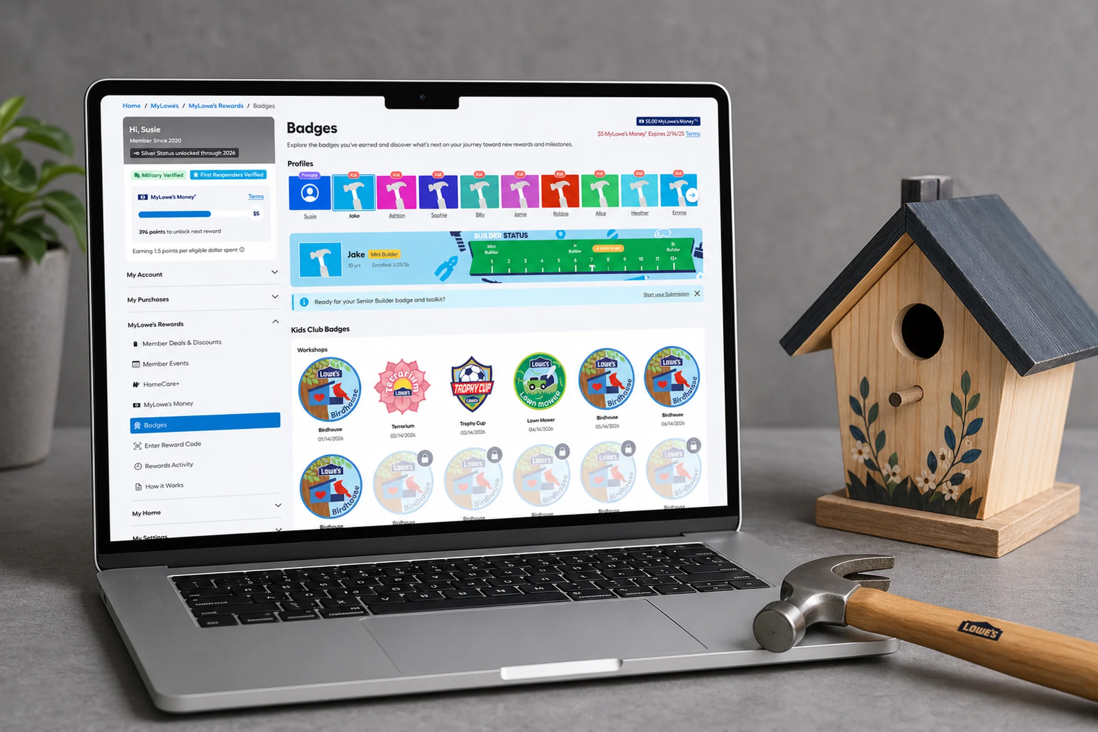
In stores, the workshops were beloved — parents still stake out the spots when the window opens, with events filling within hours. The kids get to leave with hand-built projects and physical scout-like badges they could show off — you gotta collect em’ all!
Unfortunately, the digital front was another story altogether. Marketing redirects and a few dead ends, it wasn’t the easiest place to find on the site. The bones were good, but there was so much of an opportunity to truly raise the bar. We knew if we could really execute this well it would give us a meaningful edge on the orange guys.
People needed a digital equivalent to the great physical experience, and we knew that was the valid play, but how should we get there? Not only did we need to shift from the physical to the digital for execution, but we needed to think about how the data was stored, managed, and displayed to our users, all in a compelling and fun way.

Challenge :
Many aspects of the existing system were built somewhat piecemeal from various previous forays into the “Events” space. Events have traditionally been very successful for us so it was natural to not want to spoil the system with any big changes.
But through competitive research and listening to our users, we found that there was a real appetite for a digital equivalent of the great in-store experience for events. There were some inconsistencies that needed to be ironed out for a more fluid user flow, to truly give any solution some sturdy footing.
There were various stakeholder groups that needed to be considered, as this was a very high-profile project that had lots of eyes on it, tracing all the way up to the CEO. To make the internal powers and the end users both happy would require some great research-driven considerations, and a knack for weighing tradeoffs, both on the front and back end of the experience.
From how many kids should the account permit to how many times do we need to show a parent a consent form, the requirements from the tech and legal side were piling up. I crossed the aisle on multiple occasions to make sure we were aligned, and brought disparate groups to the table that often wouldn’t talk to each other, no easy task.
Where should we add kids? How many entry-points? How many kids per account? What about adults with no kids? These were just a few of the challenges we faced in the execution of this project. What at first appeared a very simple feature group seemed set to spiral, what would become of Kids Club!?

Solution :
The final system was a solution all stakeholders (and our valued users!) could agree on: we had something great here. It accurately caught the same value-driven set of expectations the physical experience promoted, and then some.
Kids could go to an event and get a digital representation of what they had physically on their sash. Parents could get a great experience that instills good values into their kids with a great online framing. It was a win all around.
The technical hurdles were accounted for (10 kids max for dev considerations, one consent form fill for all your kids, etc.), and we had a game plan of what advancement we could take on next — keeping our devs time sacred while giving a clear roadmap of improvements in the coming quarters (EX: Paid events).
Whether signing up on the fly or reviewing in your Personal Settings, we met our users where they wanted us and gave them multiple angles to enter and interact with the Kids Club (and broader “Events”) system at Lowe’s.

Summary :
The release exceeded expectations before the first email campaign even finished. An outreach to members who'd already attended in-person events seeded the initial wave — but more users found the experience on their own than anyone projected. The 60% adoption target, set for six months, was hit in thirty days.
The project also reinforced something about how I work. I came in with a strong position on single-entry kid onboarding — it made sense at the time, given what I understood about the consent requirements. When legal came back with a ruling that changed the calculus, I let it go. Nimbleness isn't a concession; it's part of the job.
Marketing got a win they could celebrate. The business hit its numbers. Families got a digital experience that finally matched the thing they'd already fallen in love with in stores.
We left the project with a strong framework for something that I’ve repeated several times while at Lowe’s: not just creating a product, but a forward-thinking ecosystem that can expand with our users in new and novel ways, on into the future.
One nail at a time.

More Projects
UI / UX Design
Lowe's Kids Club
Welcome to the digital front for the Kids Club events you know and love. Join us as we expand our offerings and fill you in on upcoming happenings at your local store!
Industry :
Home Improvement
Client :
ColorTrend Agency
Project Duration :
5 months
Disclaimer: Due to proprietary information, some of the details have been modified or obscured.
Disclaimer: Due to proprietary information, some of the details have been modified or obscured.
Problem :
At Lowe’s there’s always a drive to work on various user segments, sometimes even the littlest ones. Lowe’s Kids Club events is one of those initiatives, engaging youngsters with the brand, even if they can’t operate a drill yet.
In stores, the workshops were beloved — parents still stake out the spots when the window opens, with events filling within hours. The kids get to leave with hand-built projects and physical scout-like badges they could show off — you gotta collect em’ all!
Unfortunately, the digital front was another story altogether. Marketing redirects and a few dead ends, it wasn’t the easiest place to find on the site. The bones were good, but there was so much of an opportunity to truly raise the bar. We knew if we could really execute this well it would give us a meaningful edge on the orange guys.
People needed a digital equivalent to the great physical experience, and we knew that was the valid play, but how should we get there? Not only did we need to shift from the physical to the digital for execution, but we needed to think about how the data was stored, managed, and displayed to our users, all in a compelling and fun way.
Challenge :
Many aspects of the existing system were built somewhat piecemeal from various previous forays into the “Events” space. Events have traditionally been very successful for us so it was natural to not want to spoil the system with any big changes.
But through competitive research and listening to our users, we found that there was a real appetite for a digital equivalent of the great in-store experience for events. There were some inconsistencies that needed to be ironed out for a more fluid user flow, to truly give any solution some sturdy footing.
There were various stakeholder groups that needed to be considered, as this was a very high-profile project that had lots of eyes on it, tracing all the way up to the CEO. To make the internal powers and the end users both happy would require some great research-driven considerations, and a knack for weighing tradeoffs, both on the front and back end of the experience.
From how many kids should the account permit to how many times do we need to show a parent a consent form, the requirements from the tech and legal side were piling up. I crossed the aisle on multiple occasions to make sure we were aligned, and brought disparate groups to the table that often wouldn’t talk to each other, no easy task.
Where should we add kids? How many entry-points? How many kids per account? What about adults with no kids? These were just a few of the challenges we faced in the execution of this project. What at first appeared a very simple feature group seemed set to spiral, what would become of Kids Club!?
Solution :
The final system was a solution all stakeholders (and our valued users!) could agree on: we had something great here. It accurately caught the same value-driven set of expectations the physical experience promoted, and then some.
Kids could go to an event and get a digital representation of what they had physically on their sash. Parents could get a great experience that instills good values into their kids with a great online framing. It was a win all around.
The technical hurdles were accounted for (10 kids max for dev considerations, one consent form fill for all your kids, etc.), and we had a game plan of what advancement we could take on next — keeping our devs time sacred while giving a clear roadmap of improvements in the coming quarters (EX: Paid events).
Whether signing up on the fly or reviewing in your Personal Settings, we met our users where they wanted us and gave them multiple angles to enter and interact with the Kids Club (and broader “Events”) system at Lowe’s.
Summary :
The release exceeded expectations before the first email campaign even finished. An outreach to members who'd already attended in-person events seeded the initial wave — but more users found the experience on their own than anyone projected. The 60% adoption target, set for six months, was hit in thirty days.
The project also reinforced something about how I work. I came in with a strong position on single-entry kid onboarding — it made sense at the time, given what I understood about the consent requirements. When legal came back with a ruling that changed the calculus, I let it go. Nimbleness isn't a concession; it's part of the job.
Marketing got a win they could celebrate. The business hit its numbers. Families got a digital experience that finally matched the thing they'd already fallen in love with in stores.
We left the project with a strong framework for something that I’ve repeated several times while at Lowe’s: not just creating a product, but a forward-thinking ecosystem that can expand with our users in new and novel ways, on into the future.
One nail at a time.
More Projects
UI / UX Design
Lowe's Kids Club
Welcome to the digital front for the Kids Club events you know and love. Join us as we expand our offerings and fill you in on upcoming happenings at your local store!
Industry :
Home Improvement
Client :
ColorTrend Agency
Project Duration :
5 months
Disclaimer: Due to proprietary information, some of the details have been modified or obscured.
Disclaimer: Due to proprietary information, some of the details have been modified or obscured.
Problem :
At Lowe’s there’s always a drive to work on various user segments, sometimes even the littlest ones. Lowe’s Kids Club events is one of those initiatives, engaging youngsters with the brand, even if they can’t operate a drill yet.
In stores, the workshops were beloved — parents still stake out the spots when the window opens, with events filling within hours. The kids get to leave with hand-built projects and physical scout-like badges they could show off — you gotta collect em’ all!
Unfortunately, the digital front was another story altogether. Marketing redirects and a few dead ends, it wasn’t the easiest place to find on the site. The bones were good, but there was so much of an opportunity to truly raise the bar. We knew if we could really execute this well it would give us a meaningful edge on the orange guys.
People needed a digital equivalent to the great physical experience, and we knew that was the valid play, but how should we get there? Not only did we need to shift from the physical to the digital for execution, but we needed to think about how the data was stored, managed, and displayed to our users, all in a compelling and fun way.
Challenge :
Many aspects of the existing system were built somewhat piecemeal from various previous forays into the “Events” space. Events have traditionally been very successful for us so it was natural to not want to spoil the system with any big changes.
But through competitive research and listening to our users, we found that there was a real appetite for a digital equivalent of the great in-store experience for events. There were some inconsistencies that needed to be ironed out for a more fluid user flow, to truly give any solution some sturdy footing.
There were various stakeholder groups that needed to be considered, as this was a very high-profile project that had lots of eyes on it, tracing all the way up to the CEO. To make the internal powers and the end users both happy would require some great research-driven considerations, and a knack for weighing tradeoffs, both on the front and back end of the experience.
From how many kids should the account permit to how many times do we need to show a parent a consent form, the requirements from the tech and legal side were piling up. I crossed the aisle on multiple occasions to make sure we were aligned, and brought disparate groups to the table that often wouldn’t talk to each other, no easy task.
Where should we add kids? How many entry-points? How many kids per account? What about adults with no kids? These were just a few of the challenges we faced in the execution of this project. What at first appeared a very simple feature group seemed set to spiral, what would become of Kids Club!?
Solution :
The final system was a solution all stakeholders (and our valued users!) could agree on: we had something great here. It accurately caught the same value-driven set of expectations the physical experience promoted, and then some.
Kids could go to an event and get a digital representation of what they had physically on their sash. Parents could get a great experience that instills good values into their kids with a great online framing. It was a win all around.
The technical hurdles were accounted for (10 kids max for dev considerations, one consent form fill for all your kids, etc.), and we had a game plan of what advancement we could take on next — keeping our devs time sacred while giving a clear roadmap of improvements in the coming quarters (EX: Paid events).
Whether signing up on the fly or reviewing in your Personal Settings, we met our users where they wanted us and gave them multiple angles to enter and interact with the Kids Club (and broader “Events”) system at Lowe’s.
Summary :
The release exceeded expectations before the first email campaign even finished. An outreach to members who'd already attended in-person events seeded the initial wave — but more users found the experience on their own than anyone projected. The 60% adoption target, set for six months, was hit in thirty days.
The project also reinforced something about how I work. I came in with a strong position on single-entry kid onboarding — it made sense at the time, given what I understood about the consent requirements. When legal came back with a ruling that changed the calculus, I let it go. Nimbleness isn't a concession; it's part of the job.
Marketing got a win they could celebrate. The business hit its numbers. Families got a digital experience that finally matched the thing they'd already fallen in love with in stores.
We left the project with a strong framework for something that I’ve repeated several times while at Lowe’s: not just creating a product, but a forward-thinking ecosystem that can expand with our users in new and novel ways, on into the future.
One nail at a time.